Thursday 31 July 2014

Create a Motion Chart gadget using Google Sheets

***Update September 2017 - Google has now discontinued the motion chart, so the below solution will no longer work***


In Google Sheets, you have the option to simply create a chart and display this on your Google Site.  However, if you code this in a gadget, you have lots more potential to customise things. In this example I am using Google Sheet data for a motion chart, and customising the initial state that will display on my site.  A quick demo is below


I found that motion charts do not load when the data range includes blank rows. For the data I am using which gets updated automatically each week using the method I blogged about here, the data range will grow over time, which causes a problem.   The solution to this is to use the QUERY function in Google sheets to bring in only the data in an IMPORTRANGE that contains valid data. This means you can specify a large range for the importrange to cover, but wont bring in any blank rows.

In the sheet that I want the motion chart to read from, I therefore applied the following formula,

=query(importrange("https://docs.google.com/a/nihr.ac.uk/spreadsheets/d/abcdefghijklmnopqrs1234567891011", "motion!Q2:S580"),"Select Col1, Col2, Col3 where Col3 > 0")

This extracts the data from my other Google sheet for the data I want to chart, only where the third column in the range (the values) are greater than zero.

In my Google Sheet, I then went to File -> publish to the web, to make this data available for the gadget to read.

In the final chart I wanted to set the initial chart state as columns, with our network highlighted, and with unique colours for each network.  Once I applied these settings on the chart, by going to the advanced settings as per the below screenshot, it was possible to get the code for that state to then use in the gadget code so that when the chart loads, it will display exactly in this format.


Here's the completed gadget, with the live chart here:

<?xml version="1.0" encoding="UTF-8" ?>
<Module>
  <ModulePrefs title="Recruitment by LRN FY2014/5" width="600" height="500" scrolling="false">
    <Require feature="ads"/>
    <Require feature="flash"/>
  </ModulePrefs>
  <UserPref name="clickurl" datatype="hidden" default_value="DEBUG"/>
  <UserPref name="aiturl" datatype="hidden" default_value="DEBUG"/>
  <Content type="html"><![CDATA[
<head>
<script type="text/javascript" src="https://www.google.com/jsapi"></script>
<script type="text/javascript">
  google.load('visualization', '1', {'packages':['motionchart']});
google.setOnLoadCallback(drawChart);
function drawChart() {
  var query = new google.visualization.Query(
      'http://spreadsheets.google.com/tq?key=*****insert your key here******&pub=1');

  query.send(handleQueryResponse);
}

function handleQueryResponse(response) {
  if (response.isError()) {
    alert('Error in query: ' + response.getMessage() + ' ' + response.getDetailedMessage());
    return;
  }

  var data = response.getDataTable();
     var chart = new google.visualization.MotionChart(document.getElementById('motionchart'));
     
var options = {};
options['state'] =
'{"yZoomedDataMax":20000,"yLambda":1,"iconType":"VBAR","xAxisOption":"2","yZoomedDataMin":0,"dimensions":{"iconDimensions":["dim0"]},"iconKeySettings":[{"key":{"dim0":"NIHR CRN: Kent, Surrey and Sussex"}}],"nonSelectedAlpha":0.4,"orderedByX":true,"playDuration":15000,"showTrails":false,"orderedByY":false,"yZoomedIn":false,"xZoomedDataMin":0,"colorOption":"_UNIQUE_COLOR","time":"2014-04-01","xZoomedIn":false,"yAxisOption":"2","sizeOption":"_UNISIZE","xZoomedDataMax":15,"xLambda":1,"uniColorForNonSelected":false,"duration":{"timeUnit":"D","multiplier":1}};';

options['width'] = 600;
options['height'] = 500;
chart.draw(data, options);     
     
}
</script>


</head>

<body>
<span id='motionchart'></span>
</body>
       
  ]]></Content>
</Module>

(For details on how to upload a gadget and get the url to use on a Google site, see my blogpost here)

Thursday 24 July 2014

Tricks with Awesome Tables, Progress Bars, custom css and filtering Numbers

I am a huge fan of Romain Vialard's work especially his "Awesome Table Gadget" and use these extensively in my site for reporting.  This blog post shows some enhancements I have made to the out of the box gadget - my aim was to add coloured progress bars to demonstrate achievement to KPIs, to change the look and feel with some custom css, and to enable the table to be filtered by searching in a number field.

A demo of the completed table is here, which contains some dummy data.

Progress Bars

As the Awesome Tables can take HTML code and render this in the table, I wanted to produce a sample output such as this


The HTML code for this bar would be
"<div class=""PercentageBar_amber"">
<div class=""percent"" style=""width: 73&#37;;""><div class=""number"">73%</div></div>"

(The #37; is an encoded character for a % symbol which will render correctly in the table. The bar will have the class PercentageBar_amber - which allows for some custom css (which will be entered later) to target this div and change the background colour.)

To build this string up in the source sheet, I just used a formula to join together the sheet data and some HTML strings.

Custom CSS

For some tables, I wanted to make tweaks such as make the font size smaller, to enable more data to fit in to the view - for this example, I wanted to make two changes, firstly to create and colour the progress bars according to their rating, and secondly to change the colour of the header to look a bit better with the red template on my site.

To do this, I took first some sample css from Romain such as this one and then added some custom css at the end.  

/* Colour the header in red at the top and bottom */

.google-visualization-table-tr-head .gradient, .google-visualization-table-tr-head-nonstrict .gradient, .google-visualization-table-div-page .gradient {
    background: linear-gradient(to bottom, rgba(255, 78, 77, 0.95) 2%, rgba(255, 78, 77, 0.01) 7%, rgba(255, 78, 77, 0.04) 95%, rgba(255, 78, 77, 0.88) 6%) repeat scroll 0 0 rgba(42, 93, 41, 0) !important;
}


/* Progress Bars */

			.PercentageBar_red {position: relative; font-size: small; width: 100px; height: 14px; margin: 1px;}
			.PercentageBar_red DIV {height: 9px; line-height: 6px;}
			.PercentageBar_red .percent {position: relative; background-color: #ee7980; left: 0px top: 0px; z-index: 0;border: 1px solid;}
			.PercentageBar_red .caption {position: relative; text-align: center; color: #000; z-index: 1;}
			
			
			.PercentageBar_green {position: relative; font-size: small; width: 100px; height: 14px; margin: 1px;}
			.PercentageBar_green DIV {height: 9px; line-height: 6px;}
			.PercentageBar_green .percent {position: relative; background-color: #55e84c; left: 0px top: 0px; z-index: 0;border: 1px solid;}
			.PercentageBar_green .caption {position: relative; text-align: center; color: #000; z-index: 1;}


			.PercentageBar_amber {position: relative; font-size: small; width: 100px; height: 14px; margin: 1px;}
			.PercentageBar_amber DIV {height: 9px; line-height: 6px;}
			.PercentageBar_amber .percent {position: relative; background-color: #fcc564; left: 0px top: 0px; z-index: 0;border: 1px solid;}
			.PercentageBar_amber .caption {position: relative; text-align: center; color: #000; z-index: 1;}
			
						.PercentageBar_black {position: relative; font-size: small; width: 100px; height: 14px; margin: 1px;}
			.PercentageBar_black DIV {height: 9px; line-height: 6px;}
			.PercentageBar_black .percent {position: relative; background-color: #000000; left: 0px top: 0px; z-index: 0;border: 1px solid;}
			.PercentageBar_black .caption {position: relative; text-align: center; color: #000; z-index: 1;}
			
						.PercentageBar_blue {position: relative; font-size: small; width: 100px; height: 14px; margin: 1px;}
			.PercentageBar_blue DIV {height: 9px; line-height: 6px;}
			.PercentageBar_blue .percent {position: relative; background-color: #91C0EF; left: 0px top: 0px; z-index: 0;border: 1px solid;}
			.PercentageBar_blue .caption {position: relative; text-align: center; color: #000; z-index: 1;}
			
	.number {
    font-size: small;
    position: absolute;
    text-align: right;
}

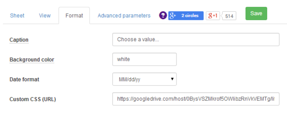
In the Awesome table setup screen, you can add this custom css in. I just saved the css file to my Google Drive in a public folder and found the published URL. Please see my blog post here if you need more details on how to do this (it works the same for css as gadgets)

Searching a Number field

One small annoyance with Awesome tables, is that if you have a numerical field, you can only have a filter that is a range filter (like a slider) or not filter it at all.  This may be appropriate sometimes, but for situations where you need to look for something like a Study ID or a part number for example, it really does not work well.  The workaround I have found works is as follows

In my Google Sheet, I have new column with a  formula which concatenates some text e.g. "StudyID" and the actual number. So instead of 123 this becomes StudyID123

Filter terms in an Awesome table can be combined, for example,  "CategoryFilter - Hidden" will do a dropdown filter for that column, but wont show that column in the table.   The trick therefore is to have your original number column as "NoFilter"  (so it displays in the table)  and for the newly created concatenated column, the filter "StringFilter - Hidden".  

With this in place, you can then search for rows containing a specific number